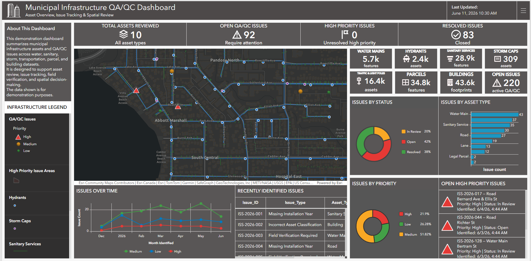
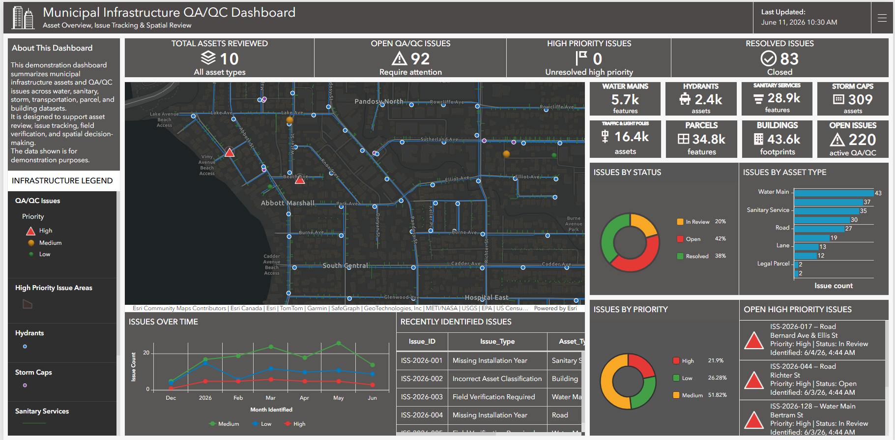
This project demonstrates how municipal GIS layers can be transformed into a dashboard-based review tool for infrastructure asset management and data-quality tracking. Using ArcGIS Pro, ArcGIS Online, ArcGIS Dashboards, and Python, infrastructure layers were organized, symbolized, published, and connected to dashboard widgets that summarize asset counts, open issues, high-priority records, resolved items, issue trends, and recently identified QA/QC concerns.
The dashboard is built around representative municipal infrastructure data and synthetic QA/QC records created for demonstration purposes.
Municipal Infrastructure GIS Dashboard & QA/QC Workflow
Tools Used




ArcGIS Dashboards
ArcGIS Online

Hosted Feature Layers
ArcGIS Pro
REST Services
-
Municipal infrastructure datasets are often spread across multiple asset layers, services, and attribute structures. Without a clear review process, it can be difficult to quickly understand which assets have been reviewed, where data-quality issues exist, and which records require field or office follow-up.
This project shows how infrastructure layers can be organized into a dashboard-ready GIS workflow. Asset layers were prepared for web mapping, QA/QC issue records were generated and attributed with priority, status, asset type, issue type, date identified, and comments, and the final dashboard was configured to support spatial review and decision-making.
The result is a practical dashboard that helps users review municipal asset data, identify high-priority issues, and understand infrastructure QA/QC status at a glance.
-
1. Infrastructure Data Preparation
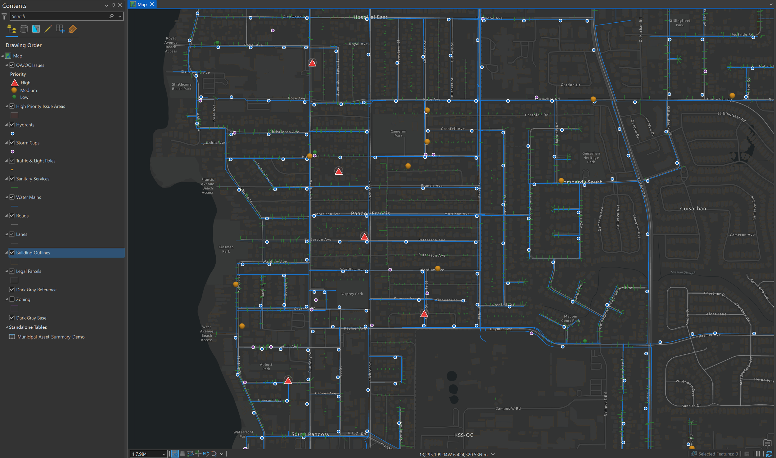
Municipal infrastructure layers were organized into a local project geodatabase and prepared for web publishing. The workflow included roads, lanes, parcels, building outlines, water mains, hydrants, sanitary services, storm features, and traffic/light pole assets.
2. QA/QC Issue Generation
A synthetic QA/QC issue layer was created for demonstration purposes. Each issue record was assigned fields such as issue type, asset type, priority, status, location name, date identified, assigned team, review requirement, and comments.
3. Web Map Design
The web map was styled to prioritize issue visibility. High-priority issues were symbolized prominently, while infrastructure, parcels, buildings, and road layers were kept visually supportive so the dashboard remained readable.
4. Dashboard Configuration
ArcGIS Dashboard widgets were configured to summarize total assets reviewed, open QA/QC issues, high-priority issues, resolved issues, asset counts, issue status, issue priority, issue type, recent records, and issue trends over time.
5. Interactive Review
Lists and tables were configured to connect back to the map so selected issue records could be located spatially. This creates a more practical review experience for GIS, engineering, asset management, and field teams.
-
This project demonstrates how GIS data can be moved beyond static layers and map products into an interactive dashboard environment. The final dashboard provides a clear view of infrastructure assets, QA/QC issue status, priority records, and recent review activity, helping project teams understand where attention is needed and how asset data can be improved.